Who Cares About Cursive? Kids Don’t Learn to Churn Butter Anymore, Either.
Readers respond to articles in our October and November issues.

Cursive Is History
Gen Z never learned to read cursive, Drew Gilpin Faust wrote in the October 2022 issue. How will they interpret the past?
Drew Gilpin Faust’s article on students’ inability to read cursive reminded me of a similar lack of knowledge that I encountered years ago, when I was teaching at the University of Colorado. I had assigned my students timed presentations. There were no clocks in our classrooms (supposedly too distracting), so I brought in a portable analog clock. To my surprise, none of my students could read it—they only told time on their cellphones.
Naomi Rachel
Boulder, Colo.
Explore the January/February 2023 Issue
Check out more from this issue and find your next story to read.
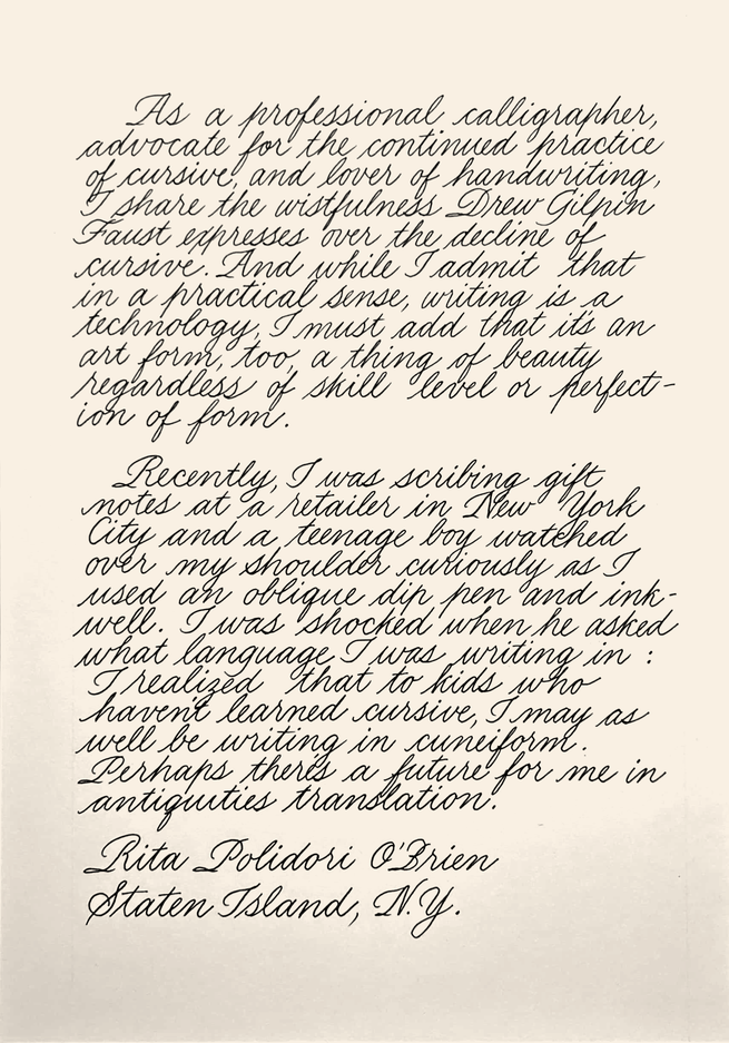
As a professional calligrapher, an advocate for the continued practice of cursive, and a lover of handwriting, I share the wistfulness Drew Gilpin Faust expresses over the decline of cursive. And while I admit that in a practical sense, writing is a technology, I must add that it’s an art form too, a thing of beauty regardless of skill level or perfection of form. It’s a wondrous visual reminder of individuality and adds an element of artistry and humanness to everyday life.
Recently, I was scribing gift notes at a retailer in New York City and a teenage boy watched over my shoulder curiously as I used an oblique dip pen and inkwell. I was shocked when he asked what language I was writing in: I realized that to kids who haven’t learned script, I may as well be writing in cuneiform. Perhaps there’s a future for me in antiquities translation.
Rita Polidori O’Brien
Staten Island, N.Y.
Like Drew Gilpin Faust, I too will grieve the loss of the art of cursive writing. I was a third-grade teacher, and one of the goals of that grade was to transition the students from printing to cursive. The lessons started in September, and by January all schoolwork was to be in cursive.
By spring, a wee little miracle always occurred. Despite the rote instruction each child received, every student organically stylized their own penmanship. Some wrote in concise, blocky letters; others were more florid and ornate. By May, an unsigned test or report was easily recognizable by the student’s penmanship and returned to the owner, like a note passed secretly between friends.
The loss of cursive will be a loss of individuality that today’s students won’t even know they’ve suffered—but I will.
Rebecca Lee
Rocky River, Ohio
When I was in grammar school in the 1950s, we were taught cursive in the third grade, after having learned the ABCs in caps and lowercase during the two years before. Bad penmanship was admonished, and corrected. We practiced.
Today I work as a lawyer, and I always have two lines for signatures—the signed name and the printed name below. This is because 100 percent of the time the former is illegible.
Recently I had to examine old land transfers in the New York City deeds records. The books, dating from the 1940s, had handwritten records of titles, names, and land-lot numbers. I was struck by the sureness of the clerks’ script, the clarity of their handwriting—it was quite beautiful. Line after line of exactitude and symmetry. And this just to record the ordinary.
Stephen M. Zelman
New York, N.Y.
Drew Gilpin Faust replies:
I am grateful for the surprising outpouring of responses to my article—in letters to the magazine, on social media, and in my own email box—because they underscored my sense that cursive’s decline marks a meaningful generational divide and cultural transition. The messages could provide material for an article of their own—touching stories of early pedagogical encounters sent by students and teachers alike, tales of the joy of mastery and artistry involved in learning cursive, and comments from dissenters ready to bid farewell to cursive with no regrets. One of my favorites of those came from a father who noted that, after all, his son hasn’t learned to churn butter. But the many moving tributes to cursive leave me convinced that it is far from dead, and not going quietly.
Let Puerto Rico Be Free
The only just future for the archipelago is not statehood, but full independence from the United States, Jaquira Díaz argued in the November 2022 issue.
As a Puerto Rican who has lived on the island my entire life and as a state representative who favors statehood, I found Jaquira Díaz’s article on our political situation deeply misleading. Its title suggests that Puerto Rico wants to be free but has not yet been allowed to be. Even worse, it argues that independence represents the “only just future” for us. The problem with these claims, and the cherry-picked historical summary to support them, is simple: In the last major plebiscite on the island, the political option with the most support was statehood and some form of free association with the U.S. Independence may well be a legitimate option preferred by the author and others, but how can the “only just” alternative consistently be the one least supported by the people? Statehood and independence supporters can agree that the decolonization of Puerto Rico is a moral imperative for the United States, but from beginning to end, that process must be centered on respect for and adherence to the democratic will of the Puerto Rican people.
José Bernardo Márquez
Toa Baja, Puerto Rico
From the Archives
In “Can a Building Be Too Tall?,” Bianca Bosker explores the engineering feats that have propelled skyscrapers to new heights. High-rises began dotting the New York skyline in the late 1800s, she writes—but not to universal acclaim.
In The Atlantic’s October 1902 issue, the author Burton J. Hendrick railed against the “latest manifestation” of skyscraper design, writing that it “consists of a succession of prosaic stories … its monotony unrelieved by the slightest ornamentation.” He was also concerned that the structures blocked sunlight, lowering the value of neighboring properties. Hendrick concluded, with some relief, that “the mania for mere bigness is subsiding.” He predicted that the large-office-building “craze” would ease up.
But the desire to build ever taller hasn’t gone away, and neither have concerns about sunlight. The luxury residential “supertalls” that loom over Central Park today prompted the creation of a “Sunshine Task Force” to look into the effects of the shadows they cast, which can reach half a mile.
Are their shadows really more troublesome than those cast by shorter, wider buildings? Maybe not, Bosker writes: The shadows of these new buildings “are long, yes, but also skinny, which means they pass quickly.”
— Will Gordon, Associate Editor
Behind the Cover
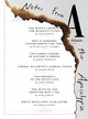
The January/February 2023 issue collects a series of articles offering dark visions of the future under the headline “Notes From the Apocalypse.” To design the cover, the art department began by experimenting with different ways of depicting destruction—fire, explosions, ominous skies—before realizing that the key lay in “destroying” the cover itself. The final image is a trompe l’oeil in which a singed cover reveals the table of contents below. This is what a magazine that has survived the apocalypse might look like.
— Oliver Munday, Associate Creative Director
This article appears in the January/February 2023 print edition with the headline “The Commons.”